Our Brand

Our Brand
Essence
of our
Promise
To us, a simple promise is more than just words. It’s when expertise meets empathy, it’s what builds momentum for collective progress, and it’s how purpose drives performance.

We wear our promise on our sleeves
To us, a simple promise is more than just words. It’s when expertise meets empathy, it’s what builds momentum for collective progress, and it’s how purpose drives performance.
Our brand identity is a direct visual representation of this very promise we stand for.

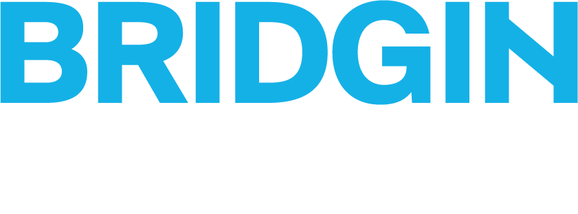
The iconic ‘N’ in our brand mark is a bespoke visual metaphor for a connecting bridge, and the monogram it creates echoes the multiple bridges that we’re building for all of Asia while cueing our ceaseless commitment to an honest and thoughtful approach.
The primary colour of blue has been chosen to capture a sense of neutrality and peace-of-mind, as we strive to work towards an equitable energy transition for all.
Last but not the least, the bold and confident font style is intended to capture the professional way we do business as well as our strong conviction in gas as an essential bridge to a sustainable future.


